Understand the EliteCryptoSignals.com-Trendview
How to read our indicator
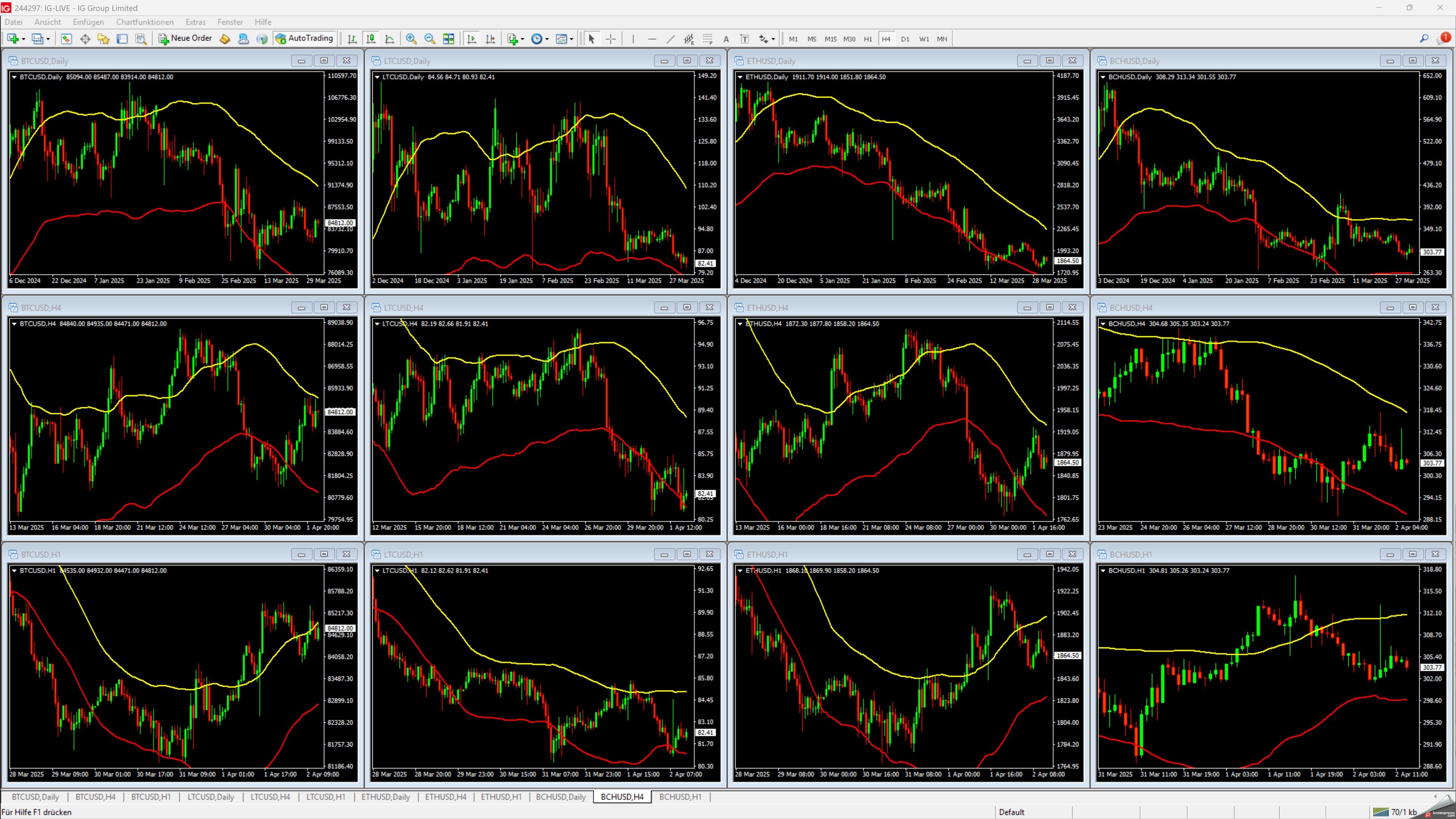
The charts of crypto coins do give some hints at what direction prices may be going in the future. I will present you a proprietary indicator plotted above the charts of BTC, BCH, LTC and ETH to get an idea above where we are currently standing and where things may be going.
1) Explanation of the charts
The charts show the prices of BTC, LTC, BCH and ETH for the timeframe which can be seen in the lower horizontal line, where dates are printed. In the upper left corner, you can also see the timeframe each green or red "candle" has in the chart (daily, 4 hours, 1 hour). The next section will present an example.
The yellow and the red lines plotted on the chart are most important to watch. When prices are above the yellow line, this generally indicates rising prices, which means an up-trend. When prices are going below the red line, this normally shows a downtrend - or declining prices - within the timeframe of the chart.
The daily chart shows the longer term trend. The 4 hour chart shows a medium term trend, the 1 hour chart the short term trend. The strongest trends emerge when all 3 timeframes show a trend in the same direction (all up or all down).
Our Proprietary Indicator : WHAT SHOWS AN UPTREND, WHEN IS THERE A DOWNTREND
There is a confirmed uptrend when one price candle (1) moves with the highest point above the yellow line, and the next price candle (2) has a price which is higher than the highests point of the previous candle. The chart has a GREEN BACKGROUND COLOUR WHEN IN AN UPTREND.
EXAMPLE (outdated):

There is a confirmed downtrend when one price candle (1) moves with the lowest point below the red line, and the next price candle (2) has a price which is lower than the lowest point of the previous candle. The chart has a RED BACKGROUND COLOUR WHEN IN A DOWNTREND.
EXAMPLE (outdated):

There is a confirmed downtrend when one price candle (1) moves with the lowest point below the red line, and the next price candle (2) has a price which is lower than the lowest point of the previous candle:
According to this model, every chart either shows an uptrend or a downtrend. Like in every price-direction-model, nothing is perfect and without error. There may be false signals (price action marks a downtrend and prices rise contrary to this, establishing an uptrend shortly after or vice versa. Nevertheless, if prices of several timeframes point in the same direction of the trend, the reliability of the trend indication rises.
HOW DO PRICES BEHAVE IN A CONFIRMED TREND
When an uptrend is established, prices can still decline in the direction of the red line and even briefly it. If this does not result in a downtrend to be established according to the rules outlined above, this does not change the direction of the trend. The opposite holds true for a downtrend.
THIS IS ALSO WHEN THE AI changes the colour of the background. SO IF YOU ARE LAZY, JUST LOOK AT THE COLOUR OF THE BACKGROUND to see if the indicators shows an uptrend or a downtrend.
2 )FREE CHARTS: Click here or on the picture below for sample charts.
Please notice: This chart may be outdated, as most recent charts are for subscribers only.